Showing posts with label css. Show all posts

Tuesday, October 11, 2016

CSS Rollover Image Effect - Change Image on Hover

Rollover image is a design feature where an image changes when your mouse hovers over it. Think of a light bulb that turns on and off when you move your mouse cursor into that area of a page. When a page is loading, rollover images are preloaded into it to ensure that the rollover effect is displayed quickly.

This used to be implemented using JavaScript, which is fairly easy with just a small amount of script involved. To make rollover images functional, onmouseover and onmouseout attributes are used to a link tag. The code is then added to a blog gadget or into a new post. It proved to have a number of disadvantages, however, which is why many web developers are using a CSS-only method.

css rollover image

How to create a rollover image using CSS

Here is how to implement a rollover image using CSS. Before getting started, we need to have two images ready, one in its initial/static state as well as its rollover state.

The Image

Place both the static and rollover image in one file and make sure that the rollover image is placed on top of the static one. To achieve the rollover effect, we'll write a code to display the static image and crop the hover image, so that only one image state is displayed at a time.

For this tutorial, we'll use the following as a CSS rollover image.

html rollover image

Creating an HTML Anchor Element for our Image

Instead of adding the image file in a <img> tag, we'll display it as a background image of an </a> (anchor) tag. Here's the HTML that we need to add:
<a class="rolloverimage" href="#URL">Rollover Image</a>
Note: if you want to make the image clickable, replace #URL with the url of the webpage where you want the link to point to.

Using CSS to Set a Background Image

To create the mouseover image effect, we'll use the :hover CSS pseudo-class. Then, we'll use the background-position property and set the values to 0 0 to move the background image to the upper left corner which will create the rollover effect.
<style type="text/css">
.rolloverimage{
display: block;
width: 56px;
height: 90px;
background: url('https://blogger.googleusercontent.com/img/b/R29vZ2xl/AVvXsEjSsorI8-a4E-wudxBMQM7VEk1oR9IcmZhLgp-EO9xe6lswXl9EVaqg1L58JupNieMtaFhCeMc0DmBx41YFVSSssYsT2sXiSXYHVl3OrN8oWwfiCnBAmEMa2rUgmVMjOMycsAkEL41tLUvA/s180/rollover-image-light-bulb-on-off.png') bottom;
text-indent: -99999px;
}
.rolloverimage:hover{
background-position: 0 0;
}
</style>
Note: Replace the text in blue with the url of your image file. Please pay attention on the width and height values marked in red, these should be different depending on your file, where the height value is for only one image and not the entire image file!

The result

Hover your mouse cursor over the light bulb to see the rollover image effect in action:

Rollover Image

Adding Rollover Image to Blogger

To add the rollover image as a gadget: copy both the HTML/CSS codes and go to 'Layout', click on the 'Add a Gadget' link > select HTML/JavaScript, then paste the codes in the 'Content' box.

Or, if you want to add it inside one of your posts, when you create a New Post, switch to the 'HTML' tab and paste the codes inside the empty box.

And this is how you make images swap on mouseover using CSS. Enjoy!

Tuesday, March 17, 2015

5 Examples To Customize Blockquote Style In Blogger And WordPress

Customize Blockquotes Style In Blogger And WordPress

Blockquotes are usually used to indicate the quotation of a large section of text from external sources or highlight someone's quotes, thoughts in blog article.

Now day's every blogger started to using it on their blog to make blog article stand out and grab the reader’s attention.

Usually all blogging platform has a default styling for Blockquotes, but we should modify a default styling with something in relevance with your theme/template. So, this tutorial will show you how to customize blockquote style in Blogger and WordPress. along with it I'll present 5 stylish examples of customized blockquotes styles for your blog using CSS.

We'll be using different pseudo-elements like   :before :after   for creating a unique look for 5 examples. 

Many bloggers have a curiosity to know Is there an advantage or impact for SEO of blockquotes?

No! I don't think so, there are many probloggers uses blockquote on their blog and I haven't seen any example that tells me it can heart SEO. but it actually help you to rank well on Google. What do you say about it?

How To Customize Blockquote Style In Blogger/Blogspot:


To add customized blockquote style in blogger just navigate to Blogger Dashboard >> Template >> Edit HTML and Search for </head>
 
Now choose one of the styles suggested below and copy the CSS code and paste it before </head> tag.
Done! Save your template!

Now whenever you want to add blockquote style in your blog post just copy that text which you want to appear as a blockquote and hit icon as shown in below screenshot:

Blogger Blockquote


How To Customize Blockquote Style In WordPress Themes:


It's quite simple to add blockquote style in WordPress themes, you need to add the following codes to style.css or custom.css file of your theme. You can do this with another way just go to Appearance » Editor in your WordPress admin or edit.

Now, pick out on of the styles suggested below and design your blog/website for a better user interface.

wordpress blockquote


#BlockQuote Style 1: Simple


 In this example I have used Unicode for left double quote. you can increase the size of quotation mark just edit  font-size:4em;  with you size.

blockquote

BlockQuote Style 1 For Blogger:


<style>
.post blockquote {
background:#f9f9f9;
border-left:6px solid #ccc;
font-family: Georgia, serif;
margin:1.5em 10px;
padding:.5em 10px;
quotes:"\201C""\201D""\2018""\2019";
}
.post blockquote:before {
color:#ccc;
content:open-quote;
font-family: cambria, Georgia;
font-size:4em;
line-height:.1em;
margin-right:.25em;
vertical-align:-.4em;
}
.post blockquote p {
display:inline;
}
.post blockquote cite {
color: #999999;
font-size: 14px;
display: block;
margin-top: 10px;
}
</style>

BlockQuote Style 1 For WordPress:

    blockquote {
    background:#f9f9f9;
    border-left:6px solid #ccc;
    font-family: Georgia, serif;
    margin:1.5em 10px;
    padding:.5em 10px;
    quotes:"\201C""\201D""\2018""\2019";
    }
    blockquote:before {
    color:#ccc;
    content:open-quote;
    font-family: cambria, Georgia;
    font-size:4em;
    line-height:.1em;
    margin-right:.25em;
    vertical-align:-.4em;
    }
    blockquote p {
    display:inline;
    }
    blockquote cite {
    color: #999999;
    font-size: 14px;
    display: block;
    margin-top: 10px;
    }

#BlockQuote Style 2: Hover Effect


This was my favorite style, I found it on codepen, In this example you can see mouse hover effect which is looking really elegant.

Blockquote With Hover Effect
  

BlockQuote Style 2 For Blogger:


   <style>
   .post blockquote {
    text-align:left;
    font: 16px/24px Arial, sans-serif;
    color: #555;
    padding: 0.5em 10px;
    margin: 1.5em 10px;
    }
    .post blockquote:before {
    content: open-quote;
    font-size: 24pt;
    text-align: center;
    line-height: 42px;
    color: #fff;
    background: #ddd;
    float: left;
    position: relative;
    border-radius: 25px;
    margin-right: 0.5em;
    vertical-align: -0.4em;

    display: block;
     height: 25px;
     width: 25px;
    }
    .post blockquote:after {
    content: close-quote;
    font-size: 24pt;
    text-align: center;
    line-height: 42px;
    color: #fff;
    background: #ddd;
    float: right;
    position: relative;
    border-radius: 25px;
    margin-right: 1em;
    vertical-align: -0.5em;

    display: block; 

    height: 25px; 

    width: 25px;
    }
    .post blockquote:hover:after, blockquote:hover:before {
    background-color: #555;
    transition: all 350ms;
    -o-transition: all 350ms;
    -moz-transition: all 350ms;
    -webkit-transition: all 350ms;
    }
    </style>

BlockQuote Style 2 For WordPress:


blockquote {
text-align:left;
font: 16px/24px Arial, sans-serif;
color: #555;
padding: 0.5em 10px;
margin: 1.5em 10px;
}
blockquote:before {
content: open-quote;
font-size: 24pt;
text-align: center;
line-height: 42px;
color: #fff;
background: #ddd;
float: left;
position: relative;
border-radius: 25px;
margin-right: 0.5em;
vertical-align: -0.4em;
display: block;
height: 25px;
width: 25px;
}
blockquote:after {
content: close-quote;
font-size: 24pt;
text-align: center;
line-height: 42px;
color: #fff;
background: #ddd;
float: right;
position: relative;
border-radius: 25px;
margin-right: 1em;
vertical-align: -0.5em;
display: block;
height: 25px;
width: 25px;
}
blockquote:hover:after, blockquote:hover:before {
background-color: #555;
transition: all 350ms;
-o-transition: all 350ms;
-moz-transition: all 350ms;
-webkit-transition: all 350ms;


#BlockQuote Style 3: Using Dashed Border And Background Quote Image


In this example I have added dashed border around blockquote, Image for double quote and I have used Muli font from Google web fonts library. 

blockquote styling with dashed border


BlockQuote Style 3 For Blogger:


<style>
.post blockquote {
@import url(http://fonts.googleapis.com/css?family=Muli);
background:url(https://blogger.googleusercontent.com/img/b/R29vZ2xl/AVvXsEgVo2vmadAgsZ22Y8AXhsV5hG3-MVrBn_50S-hFSbQa_IK3EyLCI80gOvcdilqY6BGIAbcl73Sj3Y0rjbdZ0ACQUxjQacHaAIvIOL9-HdT6J0zRjyVWqewTs-BI9oatjkTZDdrpv8JUt3cl/h120/blockquote.png) no-repeat;
border: dashed 2px #ccc;
color: #333;
font-family: muli;
margin: 30px;
padding: 20px 30px 30px 40px;  

</style>

BlockQuote Style 3 For WordPress:


blockquote {
@import url(http://fonts.googleapis.com/css?family=Muli);
background: url(https://blogger.googleusercontent.com/img/b/R29vZ2xl/AVvXsEgVo2vmadAgsZ22Y8AXhsV5hG3-MVrBn_50S-hFSbQa_IK3EyLCI80gOvcdilqY6BGIAbcl73Sj3Y0rjbdZ0ACQUxjQacHaAIvIOL9-HdT6J0zRjyVWqewTs-BI9oatjkTZDdrpv8JUt3cl/h120/blockquote.png) no-repeat;
border: dashed 2px #ccc;
color: #333;
font-family: muli;
margin: 30px;
padding: 20px 30px 30px 40px;  


#BlockQuote Style 4:


Example 4 will have cool circle around quotation mark. 
 
blockquote


BlockQuote Style 4 For Blogger:


<style>
.post blockquote{
font-family: Georgia, Times, "Times New Roman", serif;
font-size: 16px;
border-top: solid 2px #dddddd;
border-left: solid 2px #dddddd;
border-right: solid 2px #dddddd;
border-bottom: solid 2px #dddddd;
margin: 1em 0px;
padding: 1em 1em;
font-family: Georgia, Times, "Times New Roman", serif;
font-style: italic;
font-size: 1em;
min-height: 60px;
}
.post blockquote:before {
display: block;
float: left;
content: "\201C";
font-size: 100px;
margin-right: 10px;
color: #fff;
background-color: #03C9A9;
padding: 15px 12px 5px 8px;
width: 50px;
height: 50px;
line-height: 90px;
-webkit-border-radius: 50%;
-moz-border-radius: 50%;
border-radius: 50%;
}
.post blockquote cite {
position: relative;
display: block;
text-align: right;
margin-top: 5px;
color: #999;
}
</style>

BlockQuote Style 4 For WordPress:


blockquote{
font-family: Georgia, Times, "Times New Roman", serif;
font-size: 16px;
border-top: solid 2px #dddddd;
border-left: solid 2px #dddddd;
border-right: solid 2px #dddddd;
border-bottom: solid 2px #dddddd;
margin: 1em 0px;
padding: 1em 1em;
font-family: Georgia, Times, "Times New Roman", serif;
font-style: italic;
font-size: 1em;
min-height: 60px;
}
blockquote:before {
display: block;
float: left;
content: "\201C";
font-size: 100px;
margin-right: 10px;
color: #fff;
background-color: #03C9A9;
padding: 15px 12px 5px 8px;
width: 50px;
height: 50px;
line-height: 90px;
-webkit-border-radius: 50%;
-moz-border-radius: 50%;
border-radius: 50%;
}
blockquote cite {
position: relative;
display: block;
text-align: right;
margin-top: 5px;
color: #999;
}

#BlockQuote Style 5:


This was an awesome blockquote styleI found on codepen


awesome blockquotes


BlockQuote Style 5 For Blogger:


<style>
.post blockquote{
display:block;
background: #fff;
padding: 15px 20px 15px 45px;
margin: 0 0 20px;
position: relative;
font-family: Georgia, serif;
font-size: 16px;
line-height: 1.2;
color: #666;
text-align: justify; 
border-left: 15px solid #c76c0c;
border-right: 2px solid #c76c0c;
-moz-box-shadow: 2px 2px 15px #ccc;
-webkit-box-shadow: 2px 2px 15px #ccc;
box-shadow: 2px 2px 15px #ccc;
}
.post blockquote::before{
content: "\201C"; /*Unicode for Left Double Quotes*/
font-family: Georgia, serif;
font-size: 60px;
font-weight: bold;
color: #999; 
position: absolute;
left: 10px;
top:5px;
}
.post blockquote::after{
content: "";
}
.post blockquote a{
text-decoration: none;
background: #eee;
cursor: pointer;
padding: 0 3px;
color: #c76c0c;
}
.post blockquote a:hover{
color: #666;
}
.post blockquote em{
font-style: italic;
}
</style>  

BlockQuote Style 5 For WordPress:


blockquote{
display:block;
background: #fff;
padding: 15px 20px 15px 45px;
margin: 0 0 20px;
position: relative;
font-family: Georgia, serif;
font-size: 16px;
line-height: 1.2;
color: #666;
text-align: justify; 
border-left: 15px solid #c76c0c;
border-right: 2px solid #c76c0c;
-moz-box-shadow: 2px 2px 15px #ccc;
-webkit-box-shadow: 2px 2px 15px #ccc;
box-shadow: 2px 2px 15px #ccc;
}
blockquote::before{
content: "\201C"; /*Unicode for Left Double Quotes*/
font-family: Georgia, serif;
font-size: 60px;
font-weight: bold;
color: #999; 
position: absolute;
left: 10px;
top:5px;
}
blockquote::after{
content: "";
}
blockquote a{
text-decoration: none;
background: #eee;
cursor: pointer;
padding: 0 3px;
color: #c76c0c;
}
blockquote a:hover{
color: #666;
}
blockquote em{
font-style: italic;
}

Final Words!

So, this was the complete tutorial on how to customize blockquotes style in Blogger and WordPress. and I hope that you found it helpful and I’m sure it will benefit you a lot.

If you have any query's, or if I missed anything in this article please let me know, I would love to hear from you :)

Now tell me which is your favorite blockquote style? 

Thursday, September 4, 2014

How To Host Blogger CSS and JavaScript Files in Google Drive

Anyone that has ever worked on a web design or development can tell you that where you decide to store your files is important. Every time someone visits your site, the server or host will access this location and bring up the relevant files that need to be displayed. Wherever you decide to store your files, this will have an impact on some important aspects like the speed that your site loads, your overall SEO ranking and your ability to make necessary adjustments to the site.

Things To Think About

When you are designing your online structure and where to store your important CSS and JavaScript files, here is a run down on how this decision might impact your site later on:

Site Loading Speed

By combining some of the style sheets and website files, the Blogger server only has to collect information from a single location. When you split up your files or decentralize the file system, it takes a longer time for all the data to come together to make your site possible.

Slow loading speeds can negatively impact your SEO ratings because the slower the site is, the less likely that visitors are going to wait around for it to load. If someone visits your site and immediately clicks the 'back' button because it's taking too long to load, that is going to increase your bounce rate and provide Google with statistics that show your site is either low quality or irrelevant to the search keywords.

File Storage Affects SEO

In addition to increasing your bounce rate, storing your files in a central location and managing the name of your files can affect SEO site wide. Web crawlers enlisted by Google, or some of the other search engines, index both the code on your site, and the name and directory of your files. If file names are random or not placed in the proper categories, the web crawlers aren't going to know what to do with the information.

Clear file structure and a central location provide you with incentive to organize everything and name them appropriately. All the content that is relevant to the subject of your website or blog will be in the same location for web crawlers to review.

Storage Locations Affect Editing Abilities

Shuffling through files and folders or opening up FTP connections just to make some simple edits can be a hassle, and take up a lot of time that could have otherwise have been spent writing new content.

If you're a Blogger site owner, this is something you need to think about. When you need to make alterations to things like social media sharing buttons, popular posts, recent posts and related posts widgets, you have to know where everything is intended to go, or risk losing both available content and money.

Some of the larger sites that produce hundreds of unique articles each month can't afford to have content in different locations. When articles start to get lost out of order, they run the risk of duplicating content on their site, or forgetting to post it altogether. Things should be right at your fingertips to minimize mistakes and reduce the amount of time spent editing the site while it's still live.

Storing Javascript/CSS Files With Google Drive

Storing Blogger CSS and JavaScript files with Google Drive will help to eliminate any of the problems mentioned above and reduce the clutter among your services. Taking this method can increase your site speed, increase the opportunities for a successful SEO campaign, and make your life so much easier.

Google Drive provides ample amount of space to store large files, and offers collaboration services so that you can work among different team members on the same project. Some of the files that you upload into the cloud services can remain unpublished and stay within the private site, whereas other files like blog posts can be published or stored to the public site.

Another beneficial feature of storing all your Blogger files on Google Drive is that it is highly secure. Google comes with the backing of one of the leading companies in the technical world so that you can be sure your content is safe from hackers and those looking to compromise your site.

This guide will provide you with step-by-step instructions on how to setup your Blogger site using Google Drive. It's completely free to take advantage of this strategy, and will provide you with a solid platform from which to build your blog.
host blogger css javascript files

Step 1. Prepare the CSS/JavaScript Files

  • First, we need to create the file that we need to host. To host a CSS file, open the Notepad and paste the CSS code (if it is enclosed within the <style> and </style> tags, remove them). 
  • In the Notepad menu, select 'File' > 'Save as' and type the file name with the .css extension just like I did with mycssfile.css - see the screenshot below.
create a css file
  • In the same window, choose "All files" in the "Save as type" option and set the Character Encoding to UTF-8.
  • If you want to host a JavaScript file, add the .js extension (instead of .css) at the end of your file name (remove the <script>...</script> tags if you see them). Click "Save" and navigate to the location where you want to save the file.

Step 2. Upload Your File on Google Drive

  • Access https://drive.google.com and log in with your Gmail account. After you logged in, click on the 'Create' button and add a new separate folder to upload your JavaScript and CSS files.
create folder in Google drive
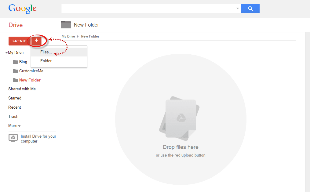
  • Open the newly created folder, and click on the Upload button with the upward arrow to choose the files that you need to upload.
upload files using google drive
  • Now, navigate to the location where you saved the files, select them (to select multiple files, press and hold down the Ctrl key on your keyboard and then click on them) and press the Open button.
  • After the files have been successfully uploaded, right click on the file names (to select all your files in the folder, click on the checkbox) and select 'Share':
share google drive files
  • In the 'Sharing settings' window, click on the 'Change' link and choose the 'Public on the web' option. Press 'Save' and copy the link(s) of your uploaded file(s) from the 'Links to share' box highlighted in blue, then paste it into a Notepad to use it later.
javascript css file sharing

Step 3. How to Add an External CSS/JavaScript file to Blogger

Before you can use the links, you must replace 'https://drive.google.com/file/d' to 'https://googledrive.com/host' and remove '/edit?usp=sharing' in the link.

For example, the link to mycssfile.css that I copied looks like this:
https://drive.google.com/file/d/0B4n9GL3eVuV-TkphMkc3SFR2Slk/edit?usp=sharing
Notice the part in blue after the "/file/d/" part. That is the file ID which is used to access it via the new hosting service. It should start with the following URL:
https://googledrive.com/host/
Add the file ID like this (remove the '/edit?usp=sharing' part):
https://googledrive.com/host/0B4n9GL3eVuV-TkphMkc3SFR2Slk
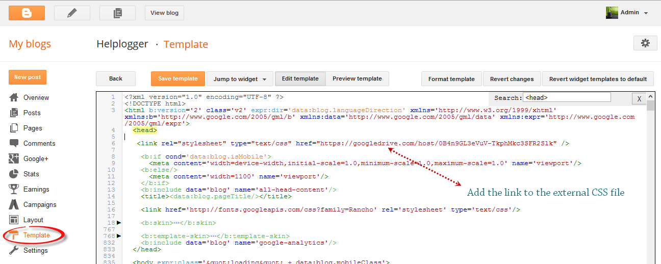
Now log into your Blogger account, select your blog and go to Template > Edit HTML. Click anywhere inside the code area and press the CTRL + F keys to open the search box:

open blogger search box

If you want to add a CSS file, type the following tag inside the search box and hit Enter to find it:
<head>
Just BELOW the <head> tag, add this line:
<link rel="stylesheet" type="text/css" href="https://googledrive.com/host/0B4n9GL3eVuV-TkphMkc3SFR2Slk" />
And replace https://googledrive.com/host/0B4n9GL3eVuV-TkphMkc3SFR2Slk with the link of your CSS file:

add external css to blogger

If you want to add a Javascript file, search for the following tag:
</body>
And add this line just ABOVE it:
<script src='https://googledrive.com/host/0B4n9GL3eVuV-eVYwLXBrTlZrVDg' type='text/javascript'></script>
Replace the line in blue with your URL:

add external javascript js to blogger

Finally, press the 'Save template' button to save the changes. And you're done!

In Conclusion

Once you have saved all your file folders and closed out of the drive, open your site in a browser and make sure that all the changes have completed successfully.

Next time you want to edit any of the information or move internal files, all you have to do is open up the Google Drive folder on your account and make the modifications from that location. Those files will then automatically sync to the online folder and make updates to your site. This works the same if you want to change the appearance by modifying the CSS code to extend the header, footer, or make customizations.

As you can see, changing your file storage out so that is CSS and JavaScript is stored on your Google Drive account is easy to do and only takes a few minutes. After you make the change, you can begin benefiting from faster loading speeds, higher SEO rankings, and overall a more convenient platform to work from to increase the efficiency of your work.

Thursday, August 14, 2014

How to Center the Blogger Header Image

The header of a website is what distinguishes your blog; it's your identity or digital fingerprint. Whenever a visitor accesses your blog for the first time, the header is one major aspect that is used to determine who you are and the type of content that they can expect to read. Therefore, it's important to develop a header that is both prominently placed and telling of your brand name.

What would seem to be counterintuitive to that idea is the default Blogger settings for header positioning. Whenever you upload a header to the site, it will automatically be aligned to the left of the page. Some Blogger users may be okay with this setting, especially if they are using a header design that doesn't contain a background. Others may find that their background headers appear cut off, incomplete, or indistinguishable from the rest of their content.

If you find yourself in the second category of users, there is a way to adjust the positioning of your header so that it is displayed as a center Blogger header. By centering your site header, you have greater flexibility over the overall design, and it allows you to really shine light on this content. It's hard to miss a header that is placed smack dab in the middle of the screen on every page that someone navigates to.

Center Header Image with Blogger Template Designer


center blogger header

Making the change is relatively easy. You'll be able to make these adjustments on every page of your Blogger blog without having to change them individually. All you need to do is to modify the CSS of your blog that can be found directly through your Blogger dashboard. Even if you have little to no experience in web design or coding, you can center Blogger header by following these next few steps.

Step 1. Log in your blogger account and select your blog, then go to "Template" and click the "Customize" button on the right side.

center blogger header

Step 2. Navigate to "Advanced" > "Add CSS" tab and paste the code in the empty box:
#header-inner {
background-position: center !important;
width: 100% !important;
text-align: center;
}
#header-inner img {
margin: auto;
}
If you have a small image and you want it to become full width, add this CSS instead:
#header-inner {
 background-size: cover;
 width: 100% !important;
 text-align: center;
 }
 #header-inner img {
 width: 100%;
 height: 100%;
 }

Step 3. Hit the ENTER key after you paste the code snippet, then click the "Apply to Blog" button.

blogger header centered

Here are some other aligning options for your headers:

Align Blogger Header Banner and Text Side by Side

Image on the right and title on the left

#header-inner {
background-position: right !important;
width: 100% !important;
}
.titlewrapper, .descriptionwrapper {
float: left;
clear: both;
margin-left: 20px;
}

Image on the left and title on the right

#header-inner {
background-position: left !important;
width: 100% !important;
}
.titlewrapper, .descriptionwrapper {
float: right;
clear: both;
margin-right: 20px;
}
Note: for larger images, you may need to resize them in order to make them appear side by side with the text.

That's it!
After making the changes to the CSS and saving your modifications, you may navigate back to your homepage. Refresh the page and you'll notice that the header is now centered, instead of on the left. Click on a few of your page links and make sure that this modification has been made to every page or post on the blog.

If by chance you don't see the changes to the header, go back through the code that you modified and make sure that you have copied and pasted the information into the file exactly as instructed. Even minor modifications in the code, or a missing semicolon may fail to make the changes you are trying to achieve, or come away with different results than what's expected.

The great thing about CSS is that it is your site's central hub for all things design. From the CSS file, you can modify just about any appearance on your site to give the blog a custom look and feel. Once you're comfortable performing minor adjustments to the appearance of your site, you can start to get creative and come up with your very own modifications.

Wednesday, August 6, 2014

Make Blogger Header, Navigation and Footer Full Width

Blogger is a user-friendly service that provides a lot of really attractive looking default templates for those just starting out. Default templates come in handy, but the nice things about owning your own blog is that you have the chance to add your own personal touch. As a matter of fact, templates aren't made to restrict your freedom of design, but instead they're there to provide you a foundation to build from. With every default template available on Blogger, you can make changes to fit your style.

One of the most common requests out of the Blogger community when making alterations is how to change the look of some of the key sections like header, navigation, and footer. Initially, these items are designed to fit within just 1/3 of the page, surrounded by padding and margins on either side. These margins are used to give the page a slim fitting appearance, but could also cause your content to look compressed.

Important: Backup your Template

Making the changes to a full screen Blogger navigation, footer, or header can be done and won't take you much time. Before you can make any changes, you should save extra copies of the template .xml file in case anything goes wrong. That way, if you don't like it or it doesn't come out looking like it should, you can reuse the contents of the original file to restore your blog to working condition.

Demo

Hover your mouse over the image to see a before and after example:


How to Make Header, Navigation and Footer Full Width in Blogger

Step #1: Access Your CSS File

If you've never opened up your CSS file before, log in to your Blogger account, select your blog and navigate to Template > Edit HTML. This will bring up the code of your template containing all your blog's internal files in one place.

Step #2: Modify the Background

Click anywhere inside the code area > press CTRL + F keys and type the following line > hit Enter to find it (stop at the first occurrence of it):
body {
Just below body { you should see some lines that will look like this:
body {
font: $(body.font);
color: $(body.text.color);
background: $(body.background);
padding: 0 $(content.shadow.spread) $(content.shadow.spread) $(content.shadow.spread);
$(body.background.override)
}
Where you see the highlighted line above in the code, remove the line and replace it with:
padding: 0px;
Different templates will have minor variations, but you should still be able to find these lines within every template.

Step #3: Change the Content Section

Next, search using the CTRL+F keys for this part:
.content-inner {
Just below it, you will see this line:
.content-inner {
padding: $(content.padding) $(content.padding.horizontal); 
}
Remove the line in red and replace it with:
padding: 0px;
This will remove any of the padding around the inner content, so it won't leave any room on both sides.

Now find this part:
$(content.background.color.selector){
Just below it you will see this line:
$(content.background.color.selector){
background-color: $(content.background.color);
}
Replace the line in red with:
background-color: $(body.background);
Finally, search for this tag:
]]></b:skin>
And just above it, add this CSS:
.main-outer {
background: $(content.background.color);
}

Step #4: Make the Content Outer Full Width

Content is displayed differently between browsers, so you'll next want to fix this so that it alters the width across the board. This code can be found searching for:
.content-outer, .content-fauxcolumn-outer, .region-inner {
And just below it you will see the following lines:
.content-outer, .content-fauxcolumn-outer, .region-inner {
min-width: $(content.width);
max-width: $(content.width);
_width: $(content.width);
}
Delete the line in red and replace that line with:
max-width: 100%;

Step #5: Finish It Up

Now you have just two more lines you need to change. Look for:
</b:template-skin>
And click on the right arrow to expand the styles. Note: you will need to search for </b:template-skin> tag again, and just before it you'll see these symbols highlighted in yellow:
]]>
</b:template-skin>
Above this ]]></b:template-skin> section of code, add the following:
.main-outer {
max-width: $(content.width);
margin: 0 auto;
}
Then run a search for:
]]></b:skin>
Add these lines of code just before/above it:
.tabs-inner {
padding: 0px;
}
.section {
margin: 0px;
}
.header-inner .widget {
margin: 0px;
}
Save the template and exit out of the editor.

Finished!

Following along with this tutorial won't affect or alter the pictures you are using on the blog, just the design of the content area. If you have a logo that stretches across the screen and fits perfectly for 1/3 page header, you will need to resize and re-upload this content so that it is able to work with the new adjustments.